This document offers the basic knowledge for installing , configuring and using the Product Builder component.
This document is copyrighted © 2012-2025 Sakis Terzis / breakdesigns.net. and is licensed under the terms of Creative Commons Attribution-NoDerivs 3.0 Unported (CC BY-ND 3.0) License [http://creativecommons.org/licenses/by-nd/3.0/].
You can distribute it freely as long as you do not modify it and state its source and/or author. You can use this document or any portion of it for commercial purposes too.
Notice — For any reuse or distribution, you must make clear to others the license terms of this work. The best way to do this is with a link to the author's web page.
If you require further permissions, for example to do changes to the current document and disctribute it to your clients, please email the author in order to acquire such a license and the source to this document.
| Product Builder 3.x |
| Joomla 5.x |
| Virtuemart 4.x |
| PHP 8.1 and higher |
| MySQL 8 and higher, MariaDB 10.4, PostgreSQL 12.0 |
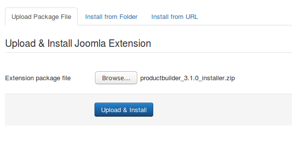
Installation
After downloading the package from our site, just install it using the joomla installation process.
Introduction
Product Builder is used to offer the end user the ability to create a custom product, selecting products from predefined product groups.
So in order to work we have to create a set of Custom Products and Groups.
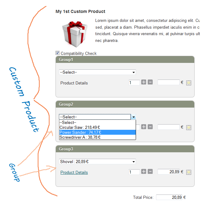
Create a Custom Product
After the installation go to the "Custom Products" view and press "New" to create a new one.
In the form you have to fill in the fields of that Custom Product. Some of them will be displayed in the front-end and some regard functionality issues.
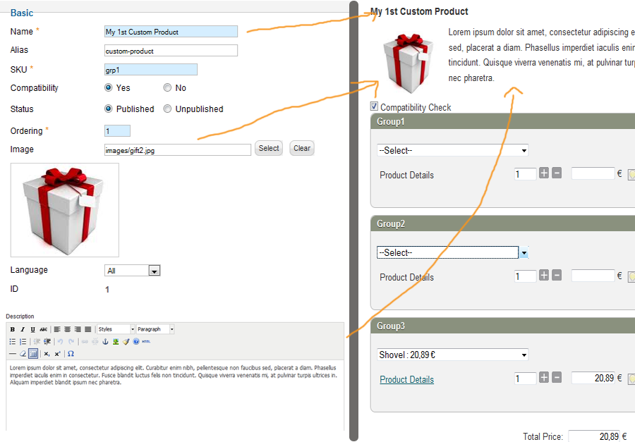
Even if a Custom Product has an image and a Description, we can set them not to be displayed in the front-end. So these fields can be used for internal use too.
If you intent to use the 'compatibility check' in your products the 'Compatibility' should be set to yes.
Use the Minimum allowed quantity and the Maximum allowed quantity if you want your kit to include a specific number of items. e.g. A wines box which can include 10-12 bottles.
A notable field here is the “Language”. Product Builder supports the joomla's multi-language feature. So if you are using more than one languages in your e-shop, you can create multiple instances of a custom product for the different languages you have.
In the right tab of the page, there are the Metadata Options. These options are used for generating meta-data tags in the front-end, that can be used by the search-engines.
Create a Group
A group can consists of multiple products or a single product if it's not editable.
To create a group go to the "Group" view and press the “New” button. Follows an explanation of the fields found in the group's form.
Basic
Name: The name of the group will be either the group's header or the 1st option in the products list.
Custom Product: is the “Custom Product” in which this group belongs.
Language: In case of multiple languages you can have groups for different languages.
Group Options
Here there are the more advanced options of the group.
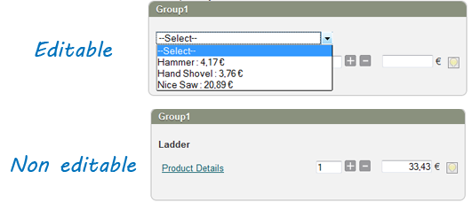
Editable: An editable group consists of multiple products while the non-editable has only one product which cannot changed by the user.
If you set a group as non-editable you have to select a Default Product too.
Mandatory: In a mandatory group, the user is forced to select a product, otherwise he/she cannot proceed to the cart.
Connect With: An editable group can get its products either from one or more Virtuemart Product Categories or from a custom collection of Virtuemart products.
Default Product: A group can have a preselected product. This can be used like a suggestion to the user. In case of non-editable group every virtuemart product can become default. For editable groups only a product of that group can be set as default.
Products Display Type: How the products of the group will be displayed. If set to "Use Global" will follow the settings in the component's configuration or in the menu items.
Quantity Options
The Quantity options can be used to set a default quantity for a group or to configure how the quantity will be displayed.
Default Quantity: The quantity of the group by default.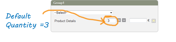
Display Quantity Box : Display or not the quantity box. If the quantity box is not displayed, the default quantity cannot changed by the user.
Quantity Box : This regards the display type of the quantity box.
It can be a single input with the 'plus' and 'minus' buttons or it can be a drop-down list with predefined options. The drop-down list is useful for products which sold in packs. e.g. 6 items pack or a dozen.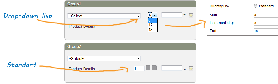
Introduction
After ceating the Custom Products and their Groups it's time to create the appropriate menu items to display the product builder layouts to the Front-end.
Product Builder comes with 2 different layouts. Each menu item type represents a different layout.
There is one layout for displaying and customizing a custom product and one for displaying a list with the exitsing custom products (Custom Products Browse Page).
Menu Items Settings
The menu items come with a series of settings. The menu items settings are overwriting the settings of the Product Builder component.
Lets see some of those settings.
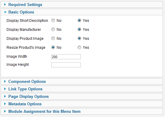
Required Settings
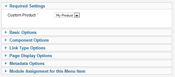
Here you have to select the Custom Product you intent to display in that layout. This setting is mandatory so you have to select a Custom Product from the list.
Basic Options
Consists of some options that concern this layout. Every type of layout has different features, so you have to set which of those features and how you want to use them.
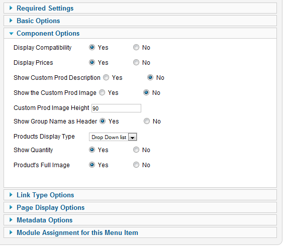
Component Options
Here there are some of those settings that exist also in the Product Builder Component's settings. As these settings are overwriting the component's settings you have to check them carefully. They regard some important issues such as the price display, the compatibility button display the group display type and others.
Steps/Pages
Using the steps you can split the groups display to different pages. This way the user experience can become much better and less tiring.
Here is how it works:

You have to press the "New Step" button wherever you want to add a page break. This will split your groups at that point and create a new step. Using the title inputs (below the groups) you can set the titles of each step.
- The Virtuemart Products should have prices to be displayed inside the PB groups. A price can be zero (0) or negative but not null (blank). Except the child products which can take their price from the parent.
- A product should be published.
- If stock check is is used within Virtuemart, the product should have stock.
- Each used product should belong at least to 1 category. Except the child products which can take their category from the parent.
- When there is not even one product that can be displayed in a group, that group won't be displayed in the front-end.
- Only Custom Fields which are set as "Cart Attribute" and "Cart Input" are being loaded by Product Builder.
- To use custom fields to select the child products of a product, you can use either the Child Variants (Virtuemart 2.x) or our Stockable Custom Fields (Virtuemart 3.x)
- If you want to display the selected products from custom products, grouped in your cart/checkout pages, please have a look at that free solution:
https://github.com/Dudebaker/Breakdesigns-Product-Builder-System-Plugin